
littlelist: fixing acquisition and engagement
I joined LittleList at an interesting stage for the business — the startup was already fully launched and functional, and the concept seemed to be getting a good response from users. With decent marketing support, people were coming to the LittleList website, but leaving almost immediately. My task was to identify the acquisition blockers and get the cogs moving.
Here are four key metrics that improved, with the wider process and further results covered in the case study.
+374%
+101%
Pledges
Page Views
+128%
~6X
Published Lists
Conversion Rate
Littlelist
LittleList is part of Cambium Group, which also runs three wedding gift list services. The platform was built on the same tech stack and user flows as its sister brands — an approach that got the MVP live quickly, but wasn't tailored to the very different needs of first-time parents navigating an overwhelming life stage.
Project Stages
research & discovery
I started by going through the website flows myself, then dug into the data — GA4 for traffic patterns, Hotjar for heatmaps and session recordings. The main entry points were the homepage (ads and socials), blog posts (organic), product categories (organic + ads). Number of users who clicked “Sign up” was very , low and from those who started, a very few (35%) finished the registration.
UX Audit
We ran multiple interviews and collected all the feedback in one structured working file. I organised it, sorted it by Good / Neutral / Bad and Product / Logistics, and pulled out the key insights that shaped the order of changes we made.
User Interviews
research outcome & strategy
It was clear that the first things to fix were the mobile experience, engagement on the website’s entry points, and onboarding.
We needed to unblock the acquisition funnel first; otherwise, there was no way to fix the rest.
A few other things that became clear after the research:
Homepage needs a clear value prop, trust signals, and better visibility for products and recommendations.
Onboarding needs to bring more value to the experience instead of being a long, boring form.
Baby Experts — actual humans users can call or message with their questions or doubts — are a massive USP.
Dashboard and Checklist are great features; they’re just not delivering the value they should currently.
Navigation needs improvement, both through the catalogue and informational pages. More cross-linking is needed.
Users want an option to add products from other sites to their list as well. We had this option, but it was limited and hidden.
The blog gets great organic traffic, but it ends there — people are not moving further into the website.
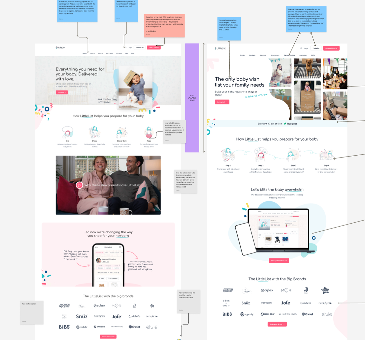
homepage redesign
As one of the website’s entry points, the Homepage required clearer messaging and more actionable elements. Busy, often on-the-go users, as we saw from interviews, viewed LittleList primarily on mobile devices (85%) — unlike wedding gift lists, which are often explored at home and on bigger screens.
So, a few key conceptual changes compared to the old versions:
Less text, more actionable elements.
Enough actionable elements within the first screen to grab users who don’t scroll.
Clear messaging about what LittleList does.
Improved mobile experience.
LittleList’s Homepage comparison for mobile devices
Results 3 weeks after launch were already indicating higher acquisition quality and more engaged users — likely because the homepage now clearly communicates what LittleList is and what you can do here. More actionable links drove users into categories and products, positively impacting browsing depth, engagement, and add-to-list rates — more people were finding the right products to add.
+12%
+75%
Page Views
Add-to-list Value
+54%
–14%
Avg engagement time
Bounce rate
+32%
+99%
Add-to-list per user
Add-to-list Quantity
+55%
+89%
Lists Published
Sale Value
onboarding
Only about 35% of users who started onboarding actually finished it. Why? Looking at the data and interviews (and also guessing), I felt there wasn’t enough value or expectation-setting around whether the product would solve their problem, or at least bring them some joy.
The old onboarding was a simple form, which, once completed, led to a generic “Thank you for registering” page with some popular products.
We replaced the form with a personalisation quiz, which ended up being a win-win: a source of personalisation and curiosity for users, and more completed onboardings, as well as more knowledge about our users for us.
Results month after launch, reported via GA4 and verified with PowerBI:
Onboarding completion rate
35% → 80%
Users adding to list on TYFR page
13% → 38%
First-session add-to-list rate
45% → 53%
Returning users
+24%
blog changes didn’t work out
Blog articles were getting quite a large amount of organic hits, so we planned to deliver a “quick win” by adding small informational block and cross links to it + make it more readable. However it seems that people landing on “Top baby names” kind of articles (our most popular) and people that actualy became the users are 2 different categories - readers on blog posts mostly did it for fun and left after an article. The best we achieved with first iteration of changes was for the readers to move to couple more articles, but no conversion. So keeping in mind other priorities we moved on with the plan to come back to blog with more time for deeper research.
Example of old vs new blog page of the same article. I only have this poor screenshot from the old one, but you can see the structure changes.
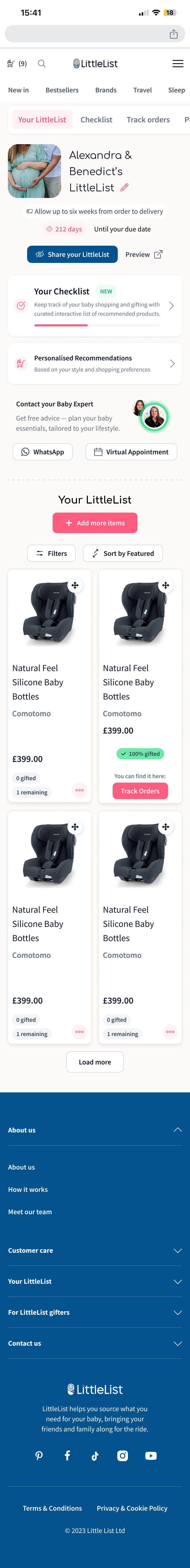
dashboard, checklist
& adding to list
After registration, users landed on a dashboard meant to be their organisational hub. It wasn't working — 51 seconds average before bouncing, frequent U-turns. A full rebuild wasn't possible due to developer availability, so we iterated:
cleaned up the layout, improved mobile nav, and gave users clear starting points — personalised recommendations, Baby Experts booking, and a checklist progress bar.
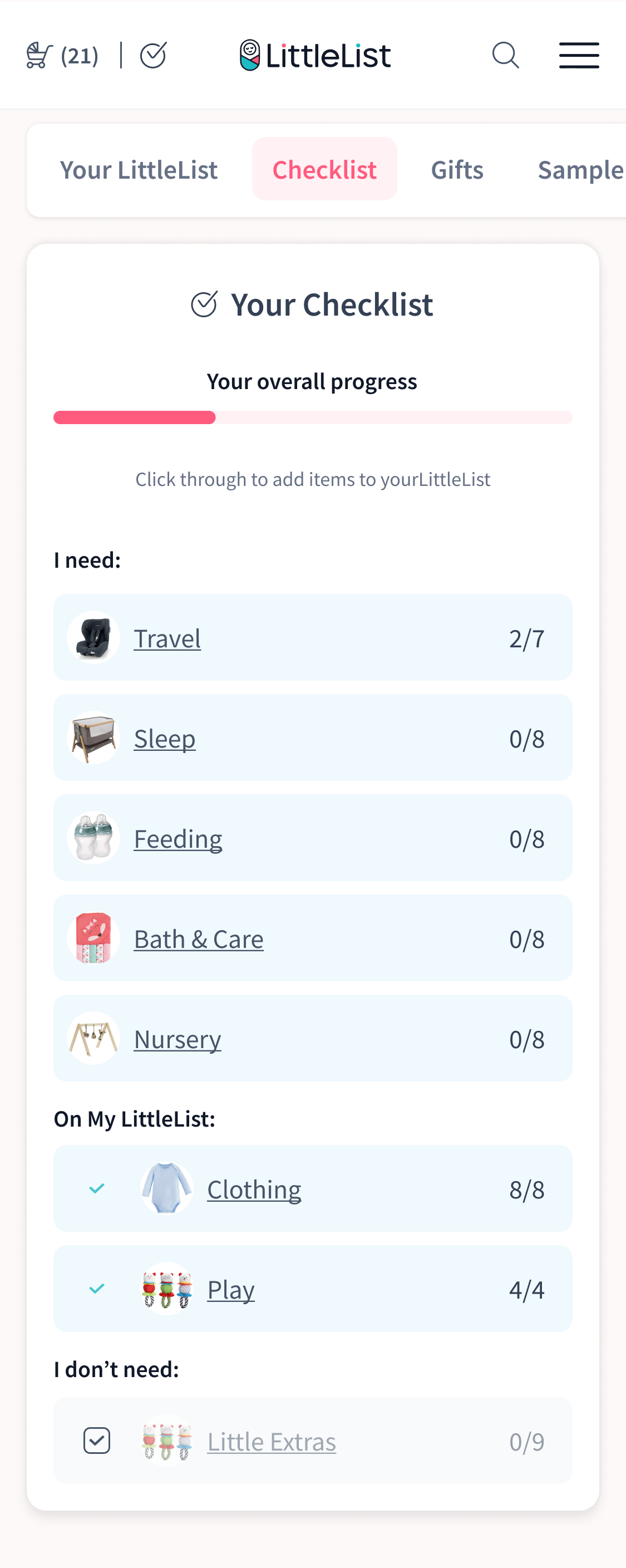
The checklist was one of LittleList's most loved features, trapped in the wrong format. It lived as a floating popup that looked like a chatbot icon — users kept dismissing it, and it was unusable on mobile. Data showed 10K clicks/month from 1.7K users but only 6% converted to Add-to-List (Hotjar confirmed most clicks were accidental). Yet the feature was highly requested in interviews, so the value was there.
We gave it a proper home. Logged-out users see an animated landing page designed to make the checklist an incentive to register. Logged-in users get it as a dedicated dashboard tab, connected to their list with a sticky "Back to Checklist" button to keep them browsing.
*Yeah I don’t have a proper mobile screen for “before” anymore, so here’s the one from Hotjar
On the previous version of the website, Checklist was an annoying floating button. Despite the idea of the feature being quite liked by users, the placement and execution were not ideal. It was also available to signed-out users, which caused confusion because there was no connection with their registry or purchases.
So, in the new version, the checklist got its proper “home” within the user’s dashboard. For logged-out users, we launched a limited version, which showed its potential but prompted users to sign up to actually use it. This became another registration boost for LittleList, as well as a way to reduce confusion around using the checklist.
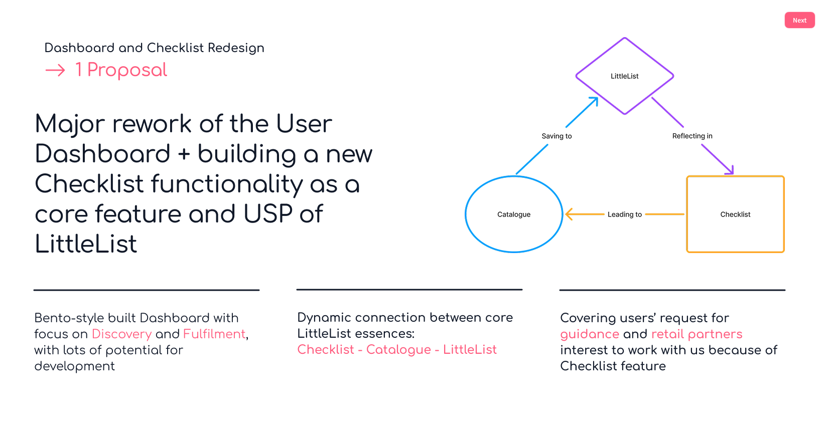
Fragment from internal pitch to stakeholders
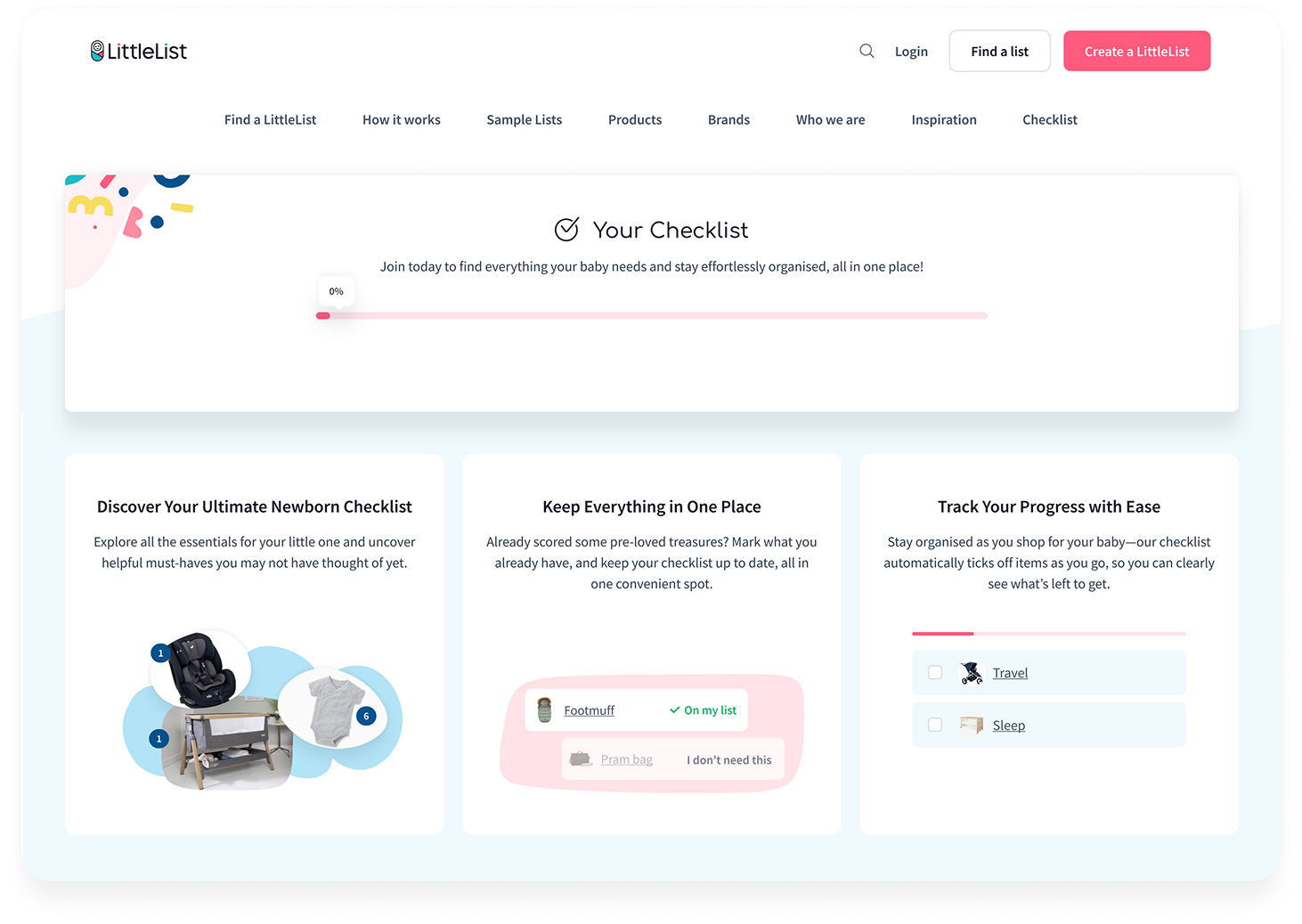
Checklist for logged-out users — accessible from the homepage, explaining how it works and why they need it before signing up
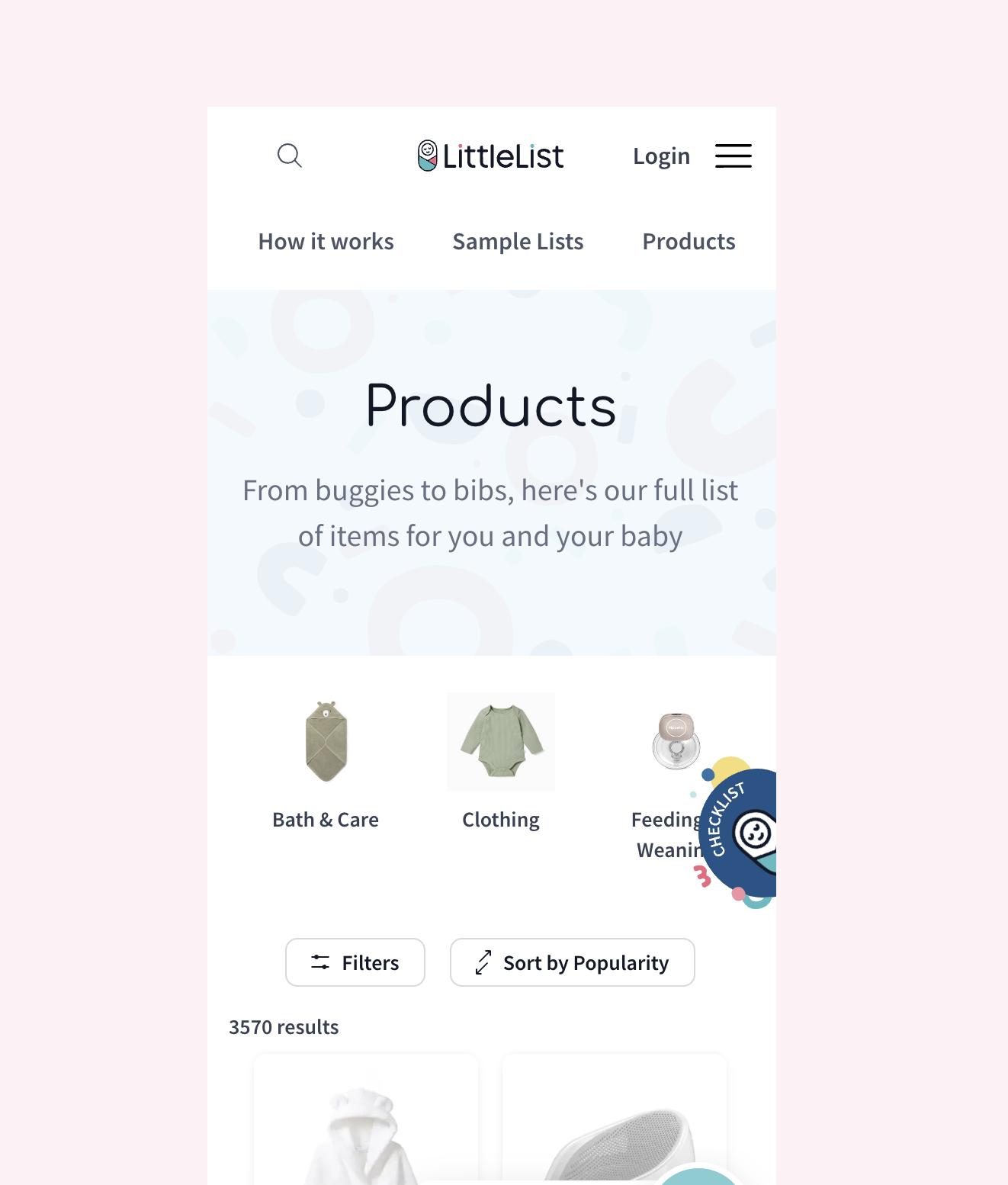
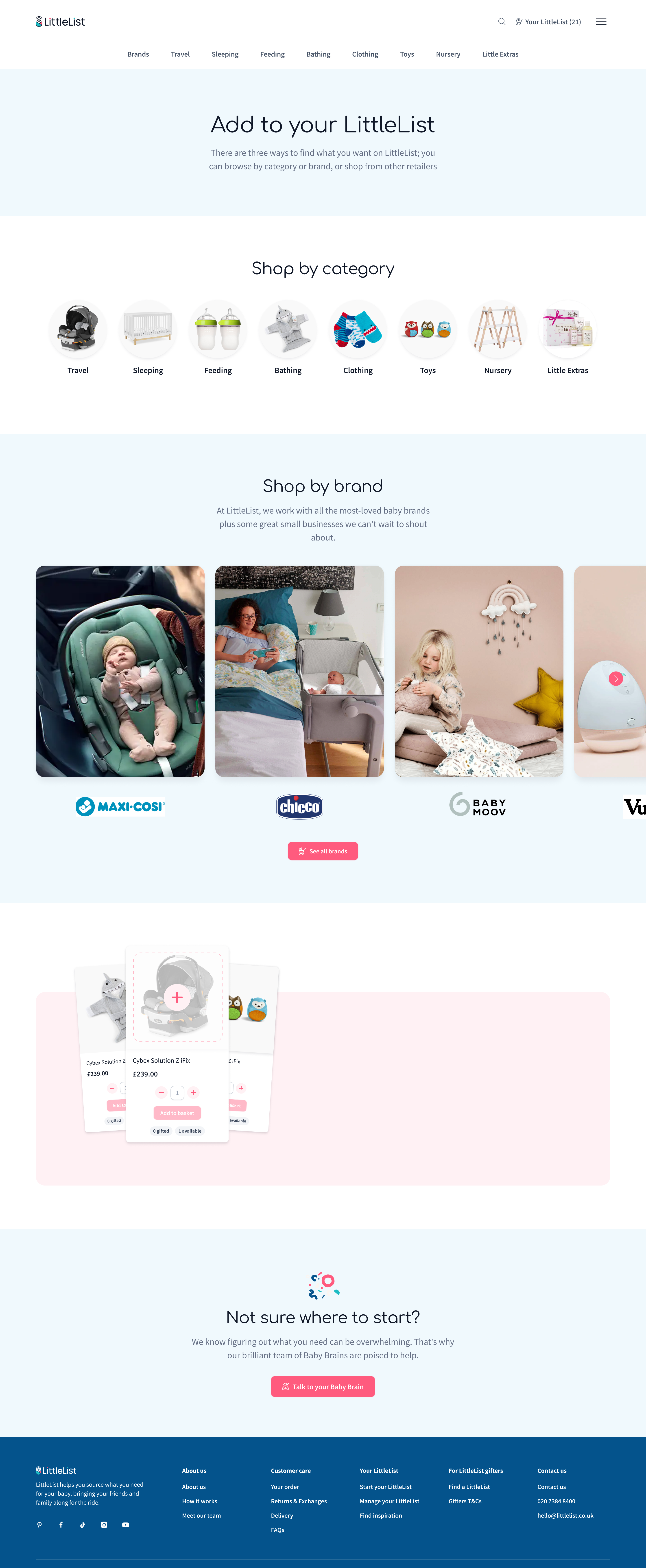
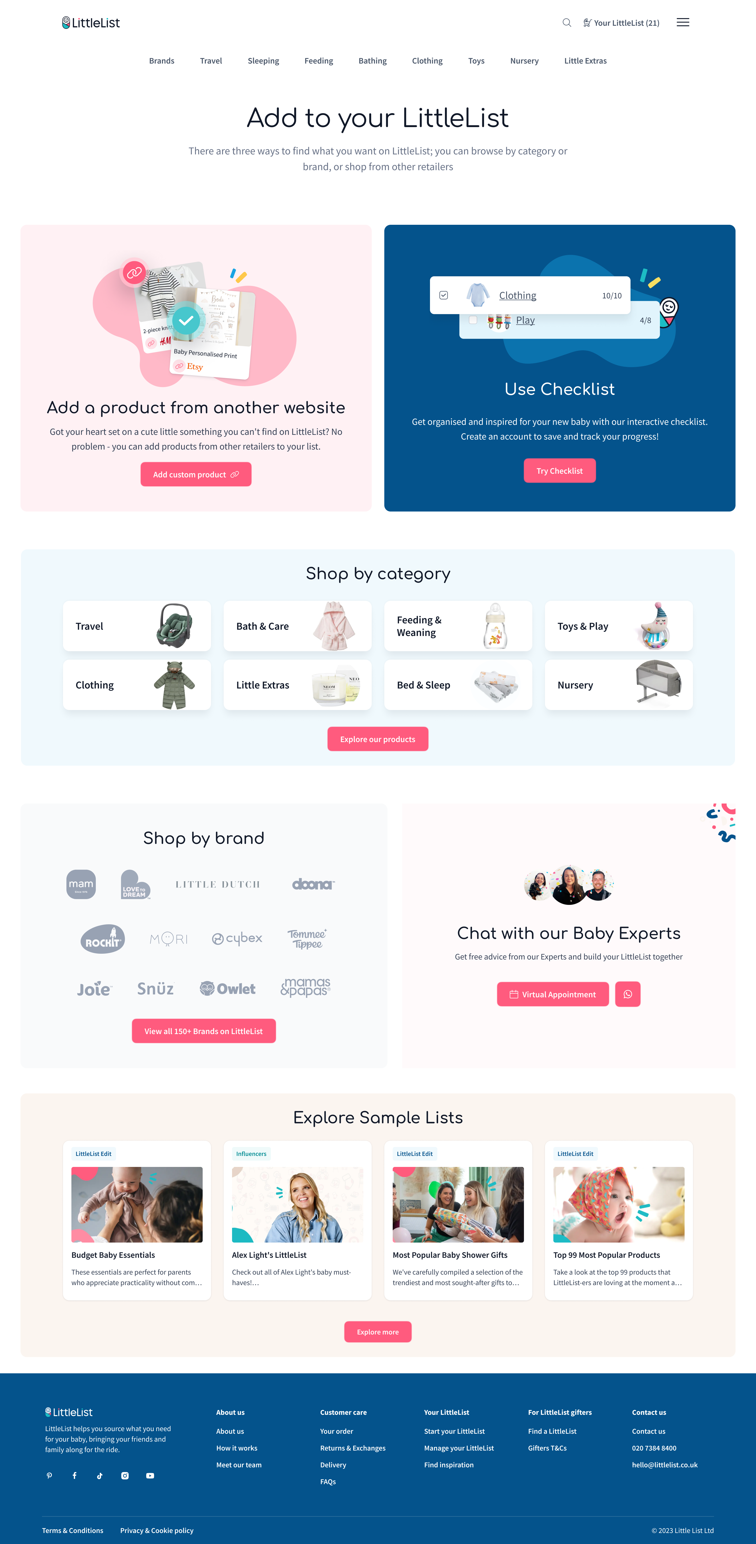
Accessible from the dashboard, this page is where registered users go to expand their list. Previously it lacked structure and actionable content. We redesigned it to showcase the checklist feature, custom products, top brands, categories, and Baby Brains — turning it into a genuine discovery hub rather than a dead end.
The combined impact of was clear within weeks after launch of those changes.
Dashboard page views grew by+71% within 2 months after launch. The new dashboard content blocks quickly became the second most interacted-with element on the page. Sharing activity picked up too: share_your_list grew 25% and group gifting more than doubled (+108%).
Most notably, checklist interactions went from not even appearing in the site's top 10 events to ranking in the top 5 — a direct result of moving it from a dismissable popup to a dedicated page with proper visibility.
outcome
More than a year of teamwork, collaboration with users, constant exploration and adjustments has resulted in LittleList finally moving from being just a good concept to a more flexible, usable product that started to match the rhythm and needs of its users — and it paid off: more engagement, retention and trust have already led to more top-ups and pledges. There are still lots of opportunities with LittleList and a long way to go for it to become an everyday planning tool and a widely recognisable registry + store + planning solution for expecting families. But the first steps have been made, the first part of the journey is unblocked, and LittleList is ready to take the next step in its development.