
Cross-brand UX initiatives, delivered inside four of Cambium's products
Not every product is yours to lead. Some of the work I've done has been on products I didn't own. I was brought in to roll out cross-brand UX initiatives that amplify those teams' work and help them hit their deadlines.
At Cambium I was hired to lead LittleList and Rock My Wedding. But I was often brought in to run specific initiatives across the core wedding brands, Prezola, The Wedding Shop and Wedding Present Co, all led by another designer (hi Daisy, you're brilliant). This case study is two of those, Cash-to-Product and Variants. It showcases my ability to work within constraints and under an existing design authority, adjusting quickly to an unfamiliar challenge to deliver results.



initiative 1
cash to product
For the wedding gift list services, by this point the couple is at the very end of their lifecycle with us. The wedding's done, no new guests are coming, the money is all in. The worst (for us) they can do is withdraw it, and the best case is that we give them a reason to spend a little of it with us instead. So this shouldn't have been a "hard sell". More an opportunity to sway couples into buying from us one last time before they withdraw their cash leftovers, or, for the couples who set out purely for cash gifts, to get them to spend at least some of it with us. Either way, the offer was simple: a bit of extra money, a discount in fact.
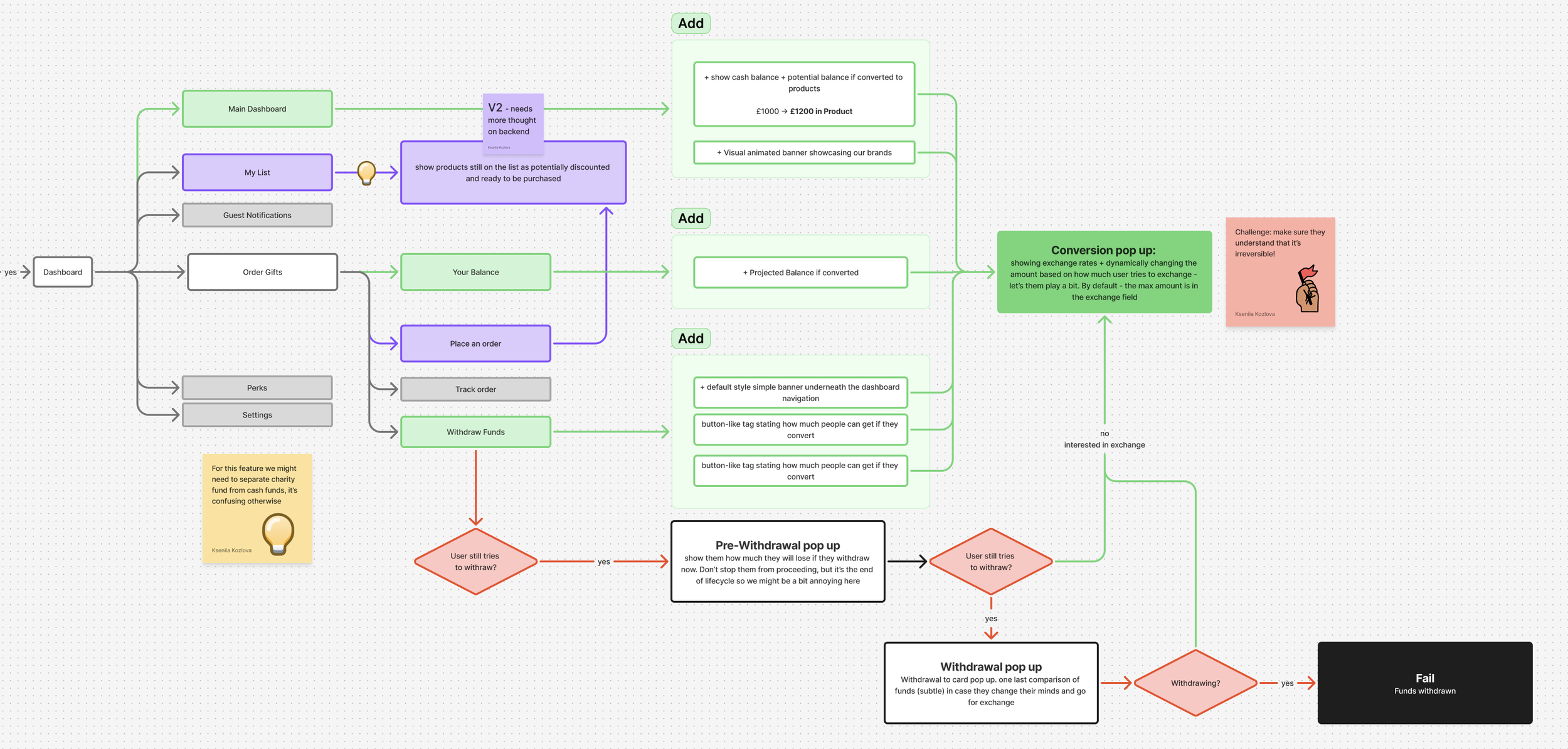
I went through the profile dashboard and picked the spots where a little nudge made sense. One rule the whole way: show the benefit, not the loss.
Right by the cash balance, a small button did the maths for them. £1,000 reading as £1,200 if you spend it with us. At the top, a banner showed the brands and their discounts of up to 20%, for couples who'd set up a cash list and might otherwise withdraw without ever looking at the catalogue. Sometimes a familiar brand at a discount is all it takes to get them looking. (I also split cash and charity funds, which used to sit together, since charity money can't be converted.)
Highlighting the benefit, without annoying users too much
Everything on the dashboard is easy to scroll past. A couple can ignore the banner, skip the button and just leave. The withdrawal screen is the one place they can't. To take the cash out, they have to land here first and actually see the choice. So I kept it to one simple step: money back to your card, or keep it as store credit with a little extra on top. The keep-it option sits front and centre, and the withdrawal is never blocked. It's still just one extra click. Not overcomplicated, just impossible to miss.
Just one extra click, but this one they can't scroll past
Cash to Product
Learnings and fixes: a tick box can't protect an irreversible action
We tested this first on one brand, and it taught me something obvious in hindsight. People are so used to terms and conditions that they tick any box in front of them without reading it. The trouble was that converting cash is irreversible. Couples would tick through, not really take it in, then ask support to reverse it later, which they couldn't do without help. So it started piling up on the support team. I didn't want to overcomplicate the journey with terms to read or an extra screen. Instead, I used a slightly unusual two-step checkbox. After ticking it, you had to read a line or two and then hit the CTA to confirm. After release the complaints all but stopped, down to the odd one, so we rolled it out to the rest of the brands.
Cash to Product
results: stable “passive income”
It recovered over £100,000 in the first couple of months which doesn’t sound much, but this was never the company's main revenue, and it didn't need to be. It's closer to passive income. A relatively low-effort journey that, once it's live, keeps quietly generating extra margin in the background, a bit like a savings account the business didn't have before. Built once, earning on its own.
initiative 2
variants
Variants is the standard e-commerce pattern: size, colour and set options held together on a single product, rather than each version sitting as its own separate item. It looks ordinary now, but the platform was never built for it. Every product page and card could only ever show one version at a time.
Variants
goals & challenges
Couples couldn't really see what was on offer, so they'd add the same towel two or three times to cover the colours, or not add it at all even when they liked it. On LittleList it bit harder, with parents giving up rather than digging for the right size or colour. Fixing it meant tedious, complex work against legacy databases, but the discoverability gain was worth it, so we went for it.
reason to do it: catalogue discovery improvements
Gonna be honest, I'm not reinventing the wheel here. Variants is a pretty well-known feature that most major e-commerce sites already have. The whole challenge sat in the constraints: mostly legacy database issues that wouldn't allow certain ways of storing the information, plus the visual side of working across four different design systems and four different card types, which were already quite tight, especially on mobile, with barely room to fit anything more.
Process and challenges
Variants
UI challenge example + UX challenge example
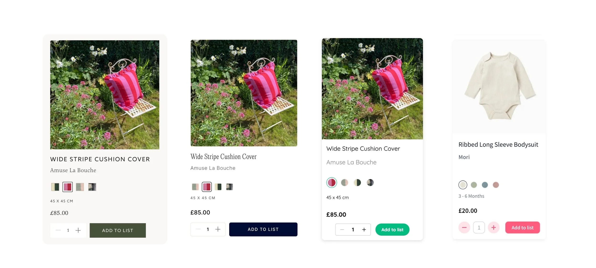
I wanted every listing card to carry two tidy rows, colour and size, with a sensible fallback when a product only had one. The database wouldn't allow it. If a product had no sizes, I couldn't even drop in a "one size" placeholder, so card heights jumped around and looked untidy. Getting the alignment clean within what the data could give me took some figuring out. I landed on an approach that at least held the most prominent parts of the card aligned, like the price.
UI challenge: variant alignment vs database inconsistencies
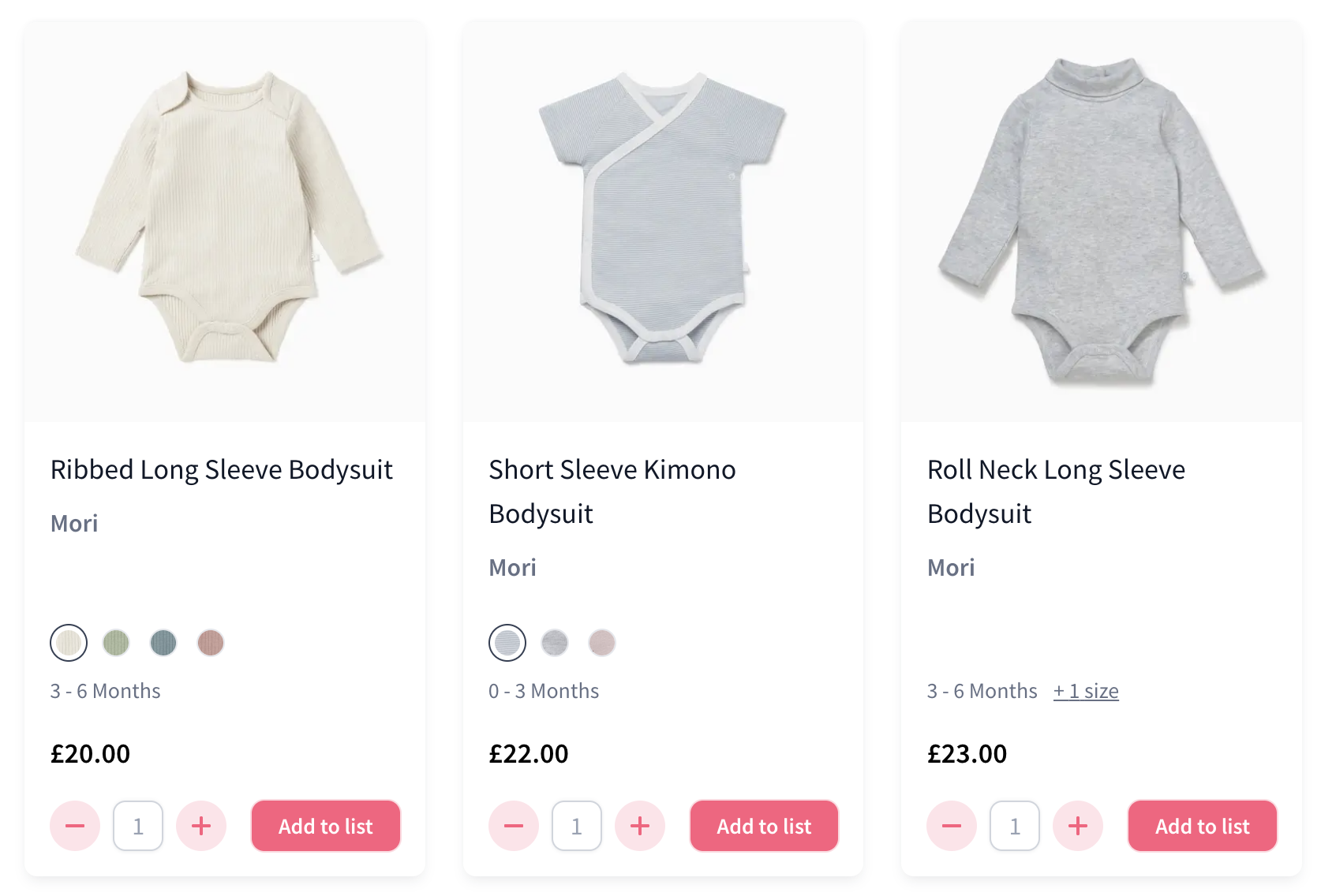
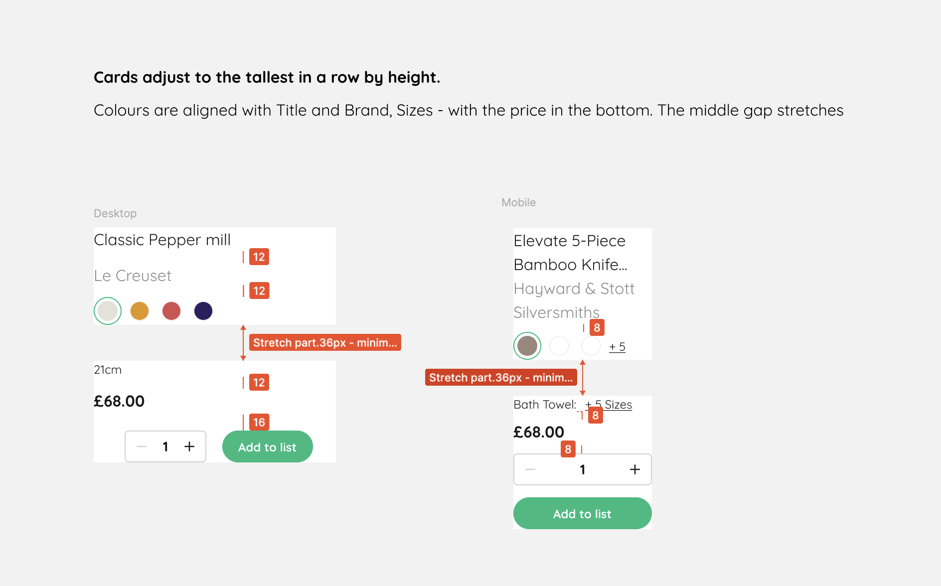
With the data this inconsistent, something had to lead. I made colour the primary selector, because almost everything has a colour but not everything has a size. Pick a colour and the available options update underneath. One-directional for V1, with reverse filtering parked for when the backend could support it.
UX challenge: colour or size first?
Variants
adapting to four design systems
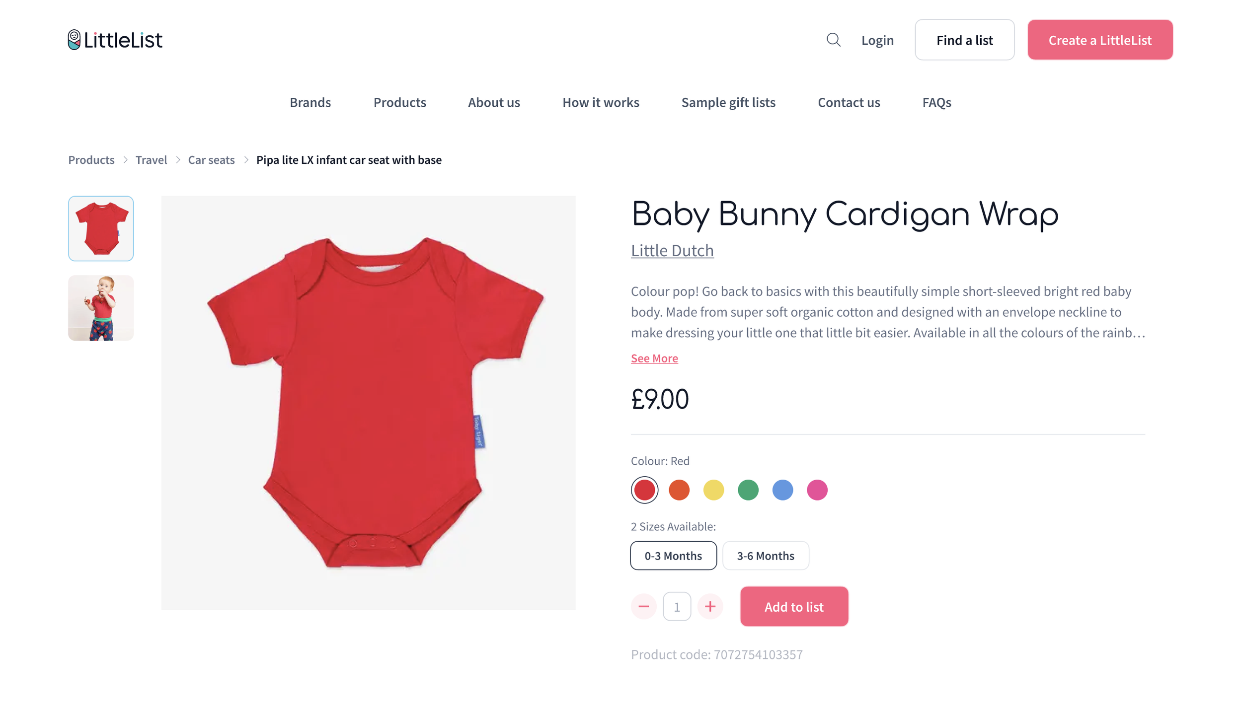
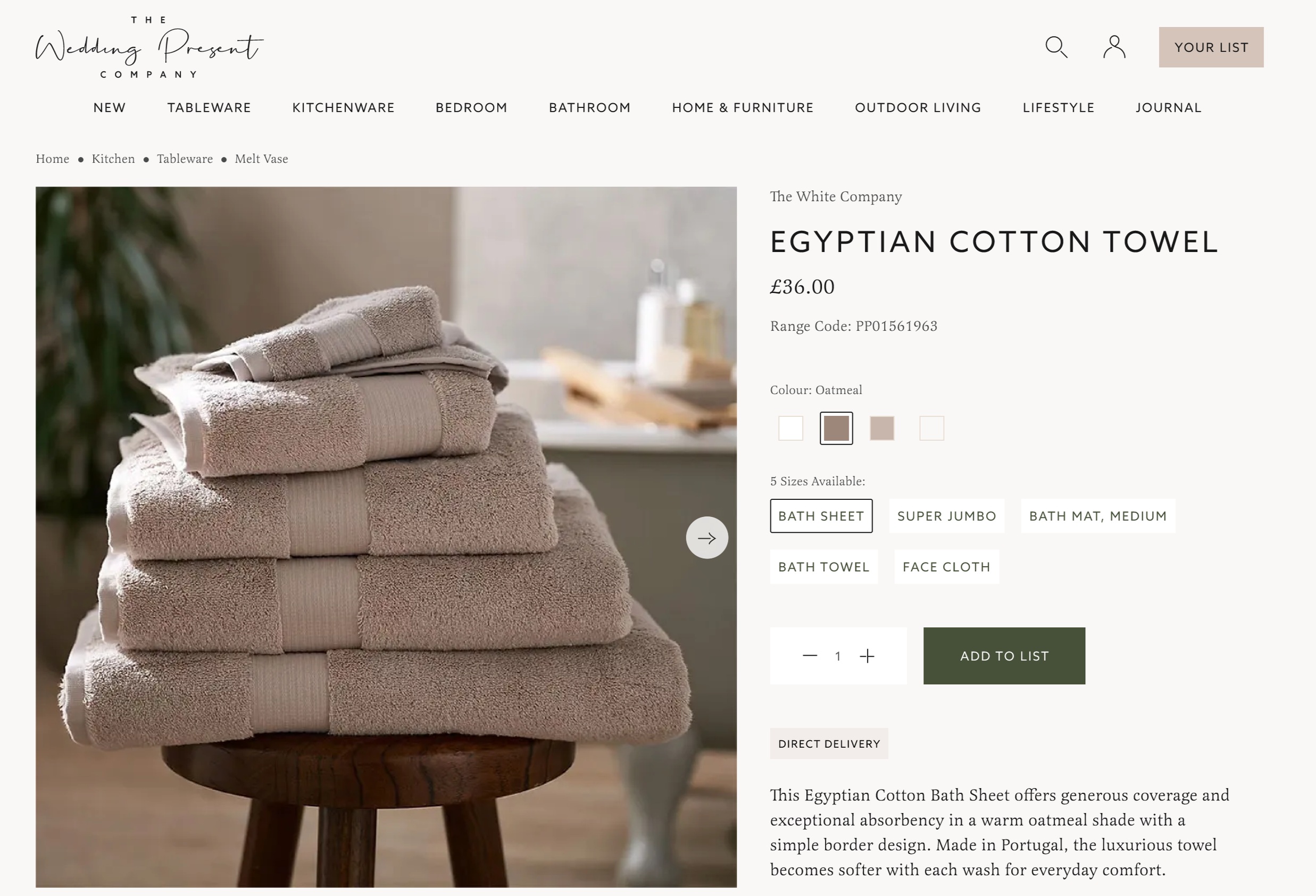
Then the brands. The same component had to feel right across four personalities. Prezola and LittleList are easy-going. The Wedding Shop and Wedding Present Co lean premium, so there the swatches went subtle and squared off to read a bit more expensive. Very little room to be visually expressive, so small choices had to carry each brand's feel rather than flatten them into one.
Mobile was the tightest squeeze, especially on LittleList. The cards are already busy and I wasn't allowed to redesign them, so fitting variants in without breaking the layout took real doing, right down to deciding how many to show when a product might have twenty colours.
outcome and point of the case study
Both initiatives delivered. Cash-to-Product recovered over £100,000 across the three brands in the first few weeks, with reversals kept under 7%. Variants pushed product page views up 45 to 68 percent and add-to-list value up 14 to 30 percent, alongside the behavioural shift we were after, with couples choosing the right version on the product page rather than adding on impulse. Mobile was the tightest squeeze, especially on LittleList. The cards are already busy and I wasn't allowed to redesign them, so fitting variants in without breaking the layout took real doing, right down to deciding how many to show when a product might have twenty colours.
But the numbers aren't the only reason these two case studies are here. I led both initiatives, even though I wasn't the lead designer on the products. They belonged to other teams, with design systems I didn't build and couldn't change. So this isn't an end-to-end product story, those sit in my other case studies. It's the other side of the work: