
Growing LittleList Through Phased UX Improvements
I joined as the Product Designer and embedded myself across every aspect of the business — not only researching user needs and behaviour, but aligning with Purchasing, Marketing, Support, and Content teams to amplify their efforts through targeted UX solutions. Together with our Product Owner, I built a phased improvement strategy and executed it over the next year. Each release made an impact, and we saw consistent growth across key metrics.
about littlelist
LittleList is the UK's first dedicated newborn baby registry and shopping service. It helps expectant parents prepare for their baby with tailored advice from in-house experts (Baby Experts), curated products, and the option to share a wish list with family and friends.
challenges
LittleList is part of Cambium Group, which also runs three wedding gift list services. The platform was built on the same tech stack and user flows as its sister brands — an approach that got the MVP live quickly, but wasn't tailored to the very different needs of first-time parents navigating an overwhelming life stage. The team knew the website wasn't performing as expected, but weren't sure whether the issue was the product, the audience, or the experience itself. My goal was to find out: run proper research and discovery, identify what wasn't working, build a strategy, and follow through with phased improvements to turn visitors into active, returning users.
Project stages
1 Research & Discovery → 2 Development by stage → 3 Results and next steps
UX Audit
I started by going through the website flows myself, then dug into the data — GA4 for traffic patterns, Hotjar for heatmaps and session recordings. The main entry points were blog posts (ranking well on organic search), the homepage, and traffic from social media and ads. None of them were converting well — and neither was the registration flow itself.
This made the priority clear: fix the entry points and registration first, before touching anything else.
1 Research & Discovery → 2 Development by stage → 3 Results and next steps
user interviews
To understand the "why" behind the numbers, we spoke with actual users — both new parents and those who had used competitor registries. We ran multiple interviews and collected a big file of feedback. I organised it into personas, sorted by Good/Neutral/Bad and Product/Logistics, and pulled out the key insights.
1 Research & Discovery → 2 Development by stage → 3 Results and next steps
discovery outcome
The research revealed clear patterns: users loved LittleList's curated selection, categories, and Baby Brains support — but struggled to find these features. The biggest pain points (pricing, delivery) were business problems requiring cross-team solutions. But UX issues — poor filtering, hidden features, overwhelming checklist, unusable mobile dashboard — those we could fix.
Strategy: What to Fix First
*Pricing and delivery required cross-team work and continued in parallel — long term and not covered in this case study.
Homepage: clear value prop, trust signals, products and recommendations visibility.
Onboarding: form → 5-step quiz with personalised recommendations.
Dashboard & Checklist: popup → dedicated page, connected to the list.
Baby Experts: Calendly self-booking, WhatsApp, visibility across all pages.
Navigation: quick links, category headers with lifestyle imagery.
Custom Products: cap lifted, manual fallback added.
Blog: CTAs added to high-traffic articles to drive registration.
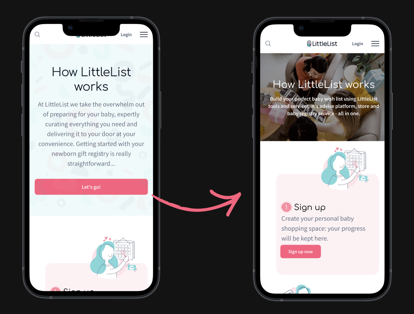
Changes to Mobile Homepage compared to old design
1 Research & Discovery → 2 Development by stage → 3 Results and next steps
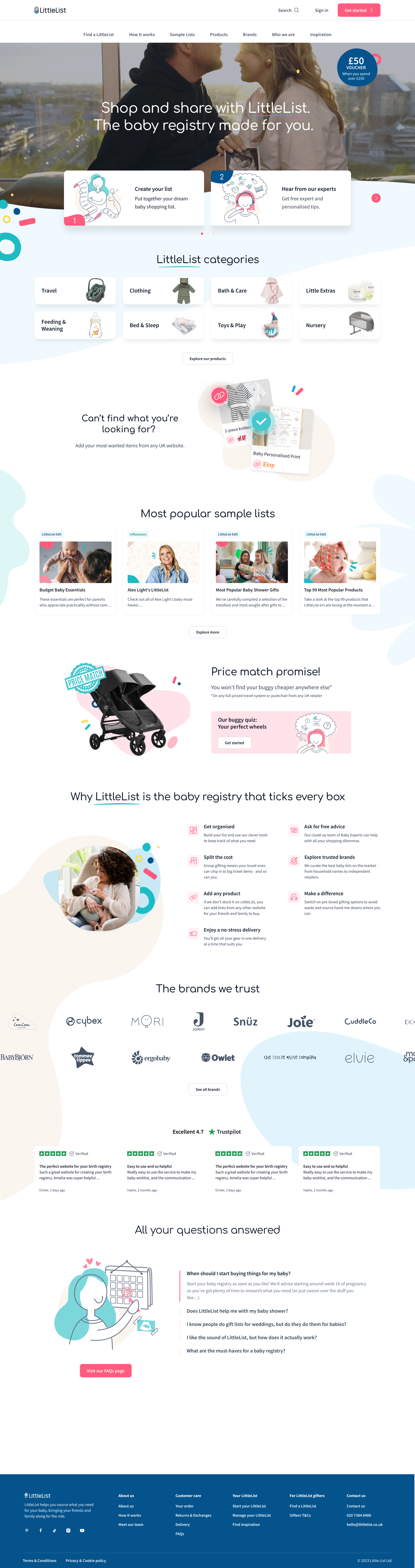
1 homepage redesign
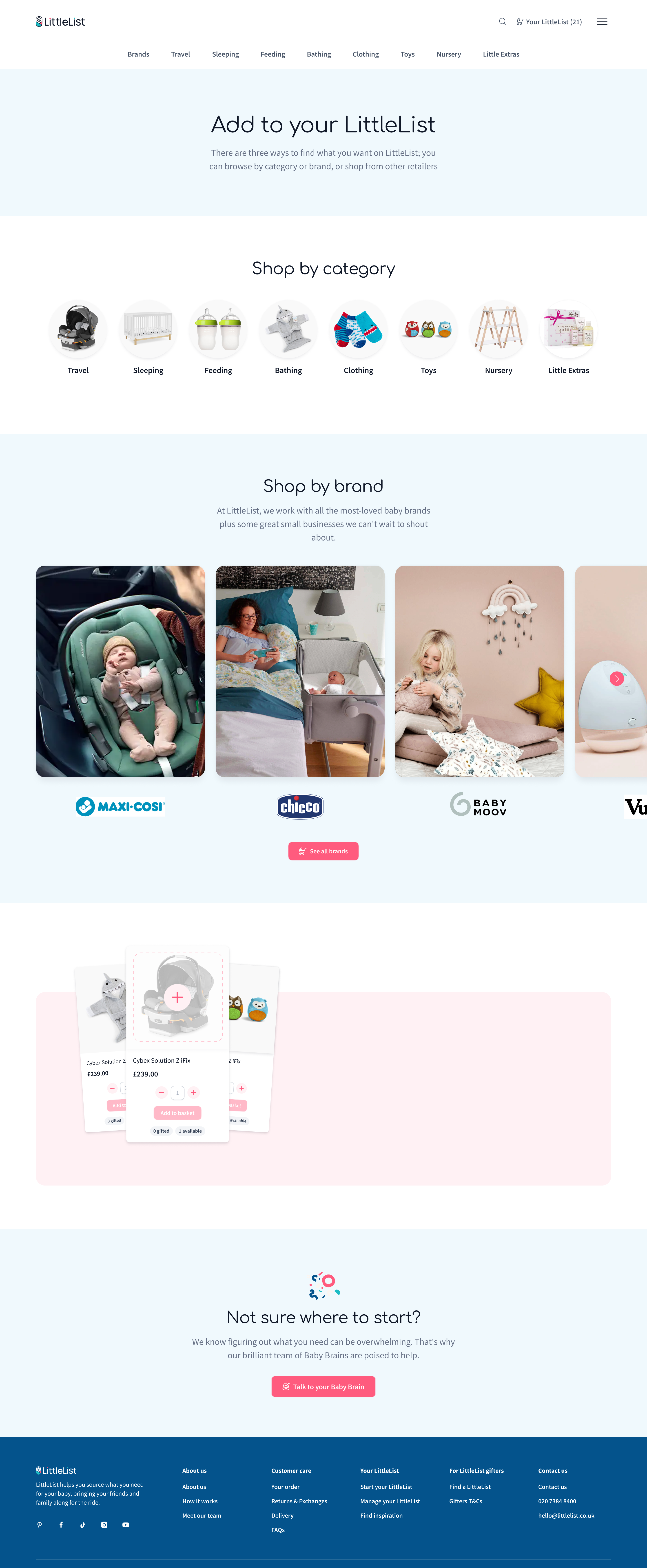
The original homepage looked polished but wasn't doing its job. Users didn't understand what LittleList was — some thought we sold pre-made boxes, others expected freebies. Heatmaps confirmed it: attention dropped off fast with almost no clicks. A previous team had a redesign in development, but after reviewing it I felt it wouldn't solve the core problems.
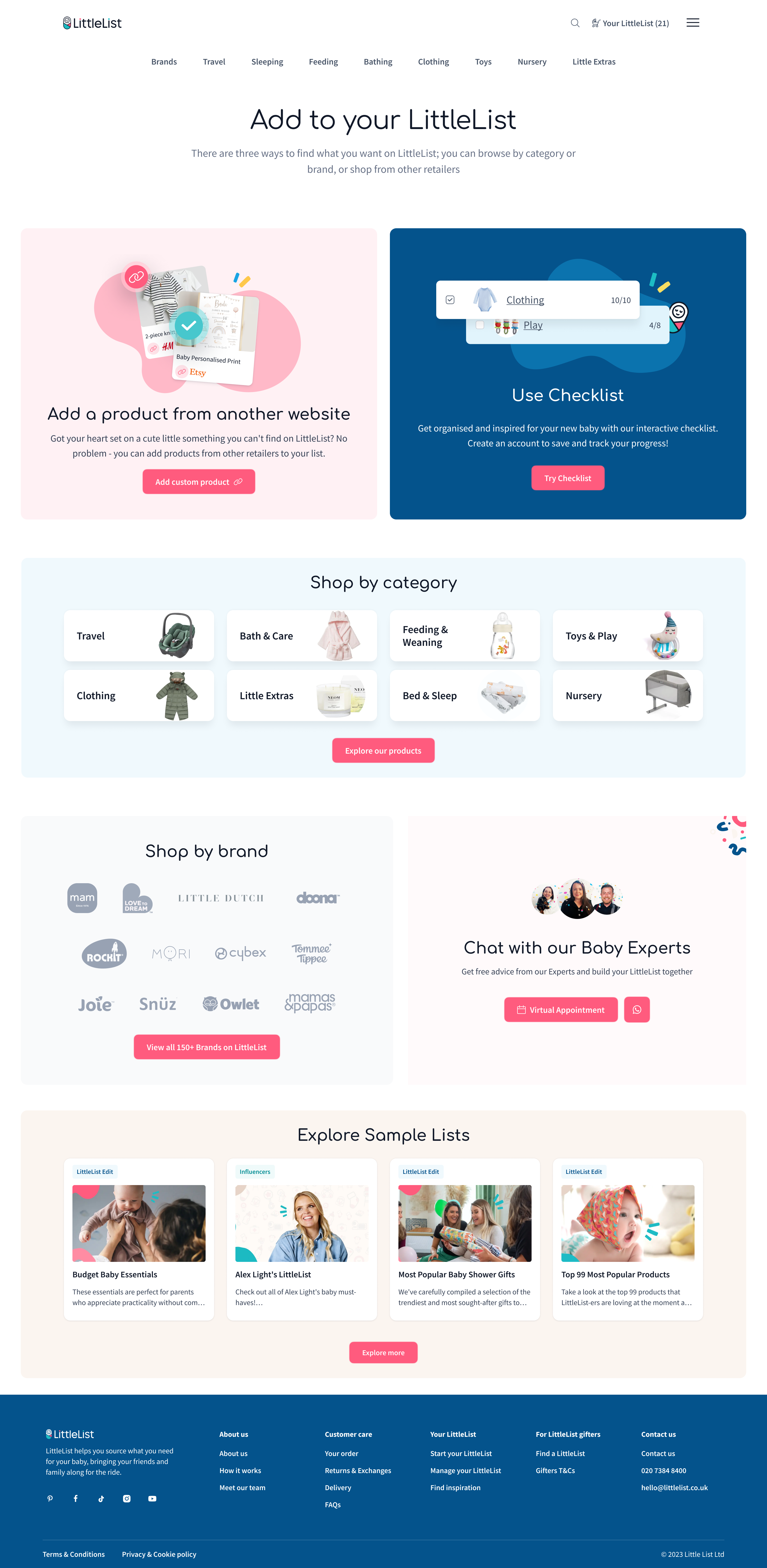
I replaced the static hero with video, rewrote the messaging to clearly position LittleList as a registry where you can shop or share, and placed all 8 product categories right after the hero — that's where engagement jumped. Kept what worked (sample lists, buggy price match) but made everything more actionable, added retention blocks further down (checklist, add-from-anywhere), and made the mobile CTA sticky.
Here’s the comparison of old and new Homepages:
1 Research & Discovery → 2 Development by stage → 3 Results and next steps
onboarding
Launched August 2024
The original registration was a standard form — functional but uninspiring. Only about 35% of users who started it actually finished. Once they did, they landed on a dashboard with no context and no clear next step. Users told us they chose LittleList because they didn't know where to start — but the sign-up process did nothing to help with that.
We replaced the form with a 5-step interactive quiz that asks about due date, style preferences, budget, and what users are looking for. The answers feed into a personalised product collection shown on the "Thank You for Registering" page — giving users an immediate reason to engage before they even reach the dashboard. It's basic personalisation, but it directly answered the most common user need: "tell me what I need."
Results month after launch, reported via GA4 and verified with PowerBI
Onboarding completion rate
35% → 80%
Users adding to list on TYFR page
*before users only could visit this page once, now they had access t their personalised recommendation from dashboard as well
13% → 38%
First-session add-to-list rate:
45% → 53%
+24%
Returning users
New Onboarding turned simple long form into Personalisation Quiz (with some form elements) which is a win-win: motivating users to finish as they are promised personalised recommendations. For business - it’s more finished registrations + information about our customers’ preferences.
New Thank You For Registering Page (following Onboarding) became personalised. Also, the Dashboard leading CTA became sticky and always visible which decreased U-turns on this page
1 Research & Discovery → 2 Development by stage → 3 Results and next steps
Cross-linking & engagement improvements
Throughout the whole period
Alongside the major releases, we shipped a series of smaller enhancements across the site — all focused on the same principle: give users more actionable paths at every touchpoint.
How it Works page
Went from a static page users scrolled past to something they actually engaged with. We condensed the layout, made each step actionable with clear CTAs — "Sign up," "Browse products," "Contact Baby Experts" — so every section had a next step, not just an explanation.
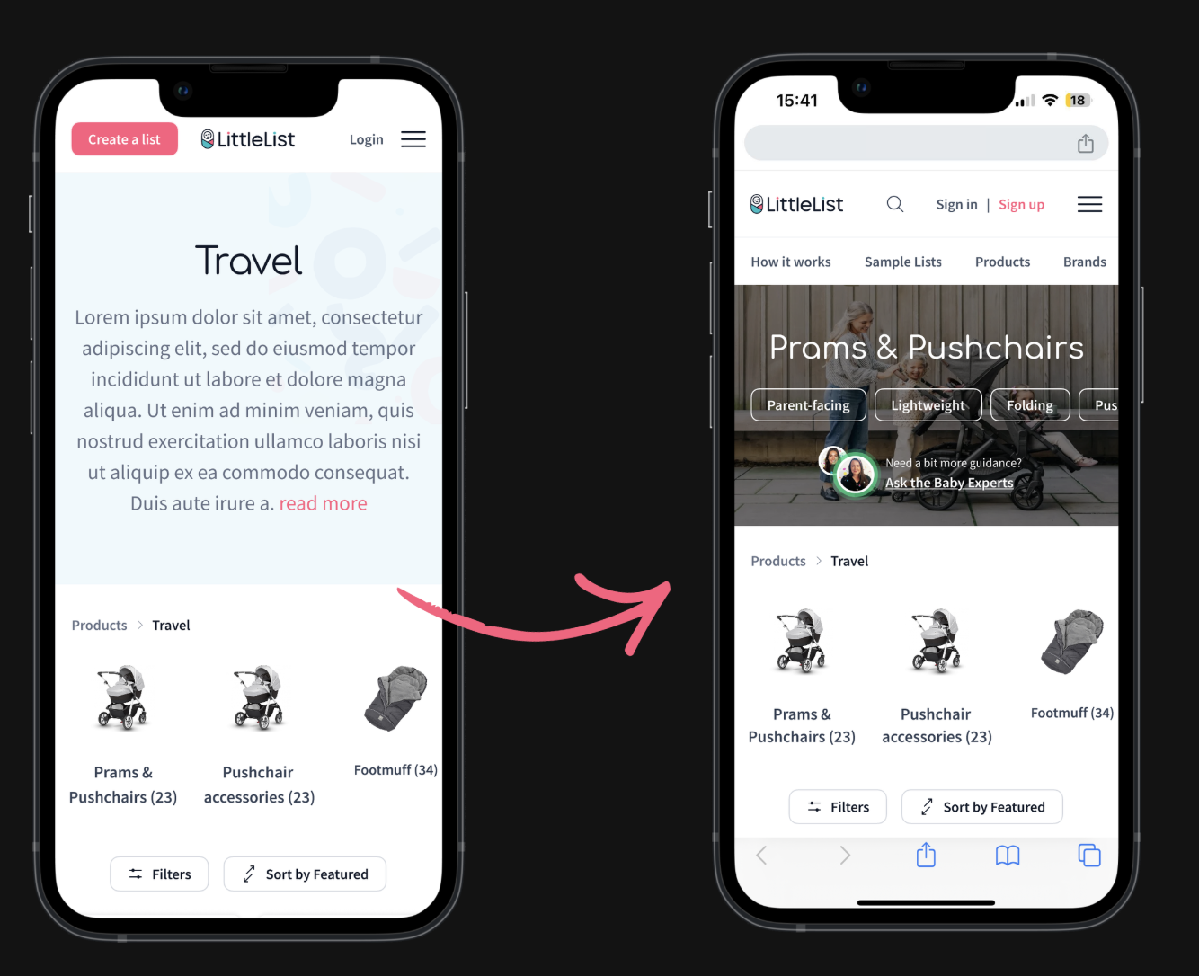
Category headers
Redesigned from oversized empty banners into useful space. We added quick links to popular subcategories, the TrustPilot score, and a Baby Brains WhatsApp CTA on every category page — making it easy to reach an expert from anywhere on the site.
Custom Products
We lifted the 10-item cap and added manual entry as a fallback for when link scraping failed, removing a real frustration for users building lists from other websites. Once launched, we promoted this feature on the homepage, which had a positive impact on returning users.
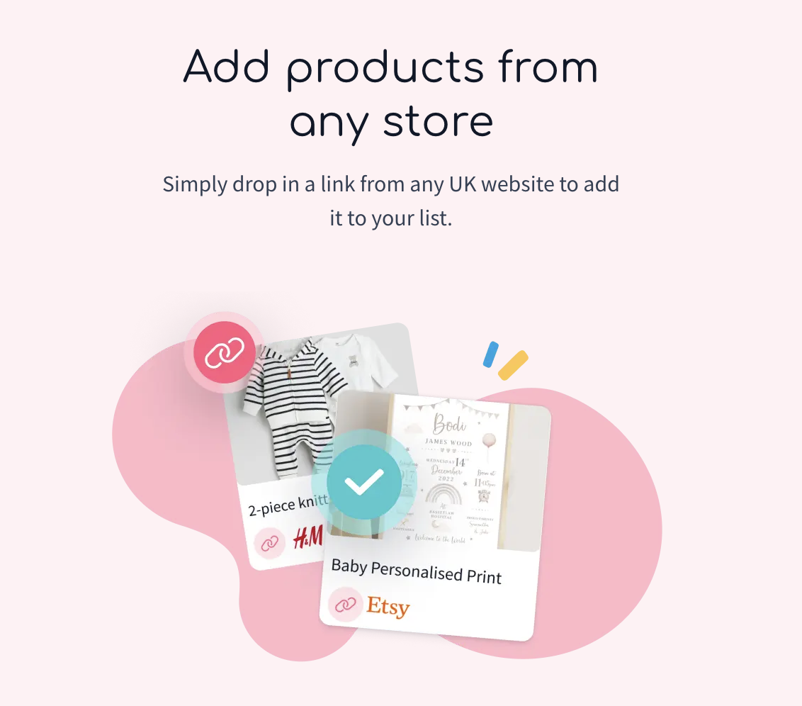
Redesigned "Add from anywhere" block — now prominent on the homepage and high up the Add to List page. Previously buried at the bottom for signed-in users only, with no visibility for new visitors at all.
Blog components
Added registration CTAs and product links into high-traffic articles to turn passive readers into active users. We only managed to update one blog post before the project paused, so the full impact wasn't realised — but the approach was proven.
Restyled blog articles — added cross-links to relevant products and informational blocks to keep users engaged and browsing
automated appointment bookings
previously users had to email to book an appointment with our Baby Experts. We integrated Calendly so users could browse available time slots and book a virtual appointment directly on the website — removing friction from one of LittleList's biggest USPs.
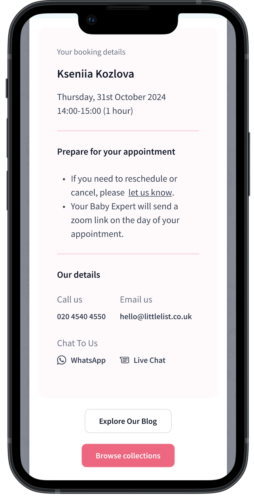
Confirmation of automated Baby Experts appointment
Individually these were small changes. Together, they created a more connected experience where every page had a clear next step — browse, add to list, talk to an expert, or sign up. Baby Experts queries increased 37% YoY by November 2024.
1 Research & Discovery → 2 Development by stage → 3 Results and next steps
Dashboard, Checklist & Add More Products
Nov 2024 – Jan 2025
These three pages form the core of the logged-in experience — where users manage their list, discover new products, and plan what they need. All three were underperforming: the dashboard was hard to navigate on mobile despite most users browsing on the go, the checklist was buried as a dismissable popup, and the Add More Products page lacked actionable content. We tackled them together to create a more cohesive post-registration journey.
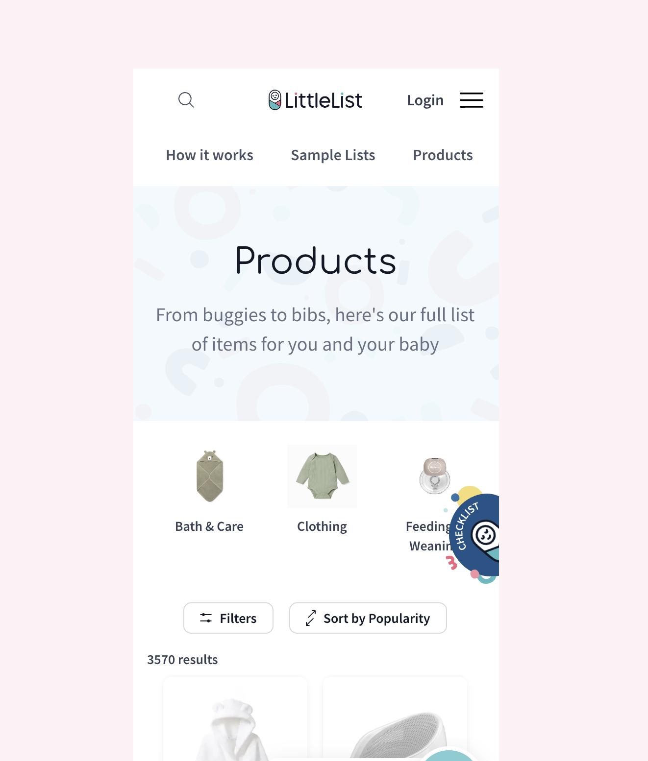
Add More Products
Accessible from the dashboard, this page is where registered users go to expand their list. Previously it lacked structure and actionable content. We redesigned it to showcase the checklist feature, custom products, top brands, categories, and Baby Brains — turning it into a genuine discovery hub rather than a dead end.
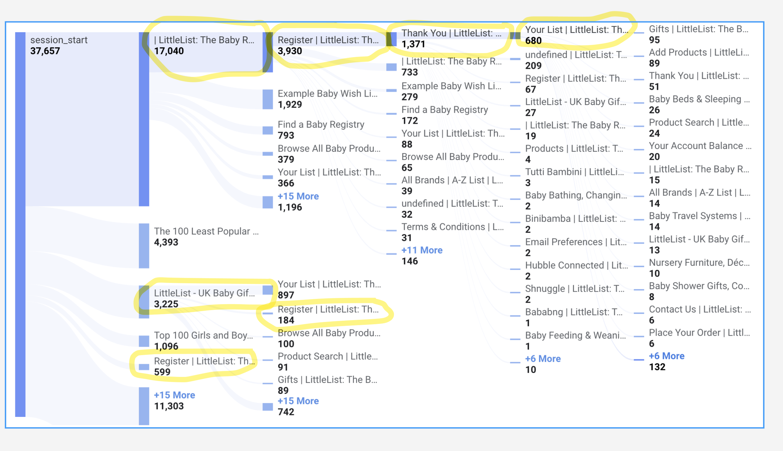
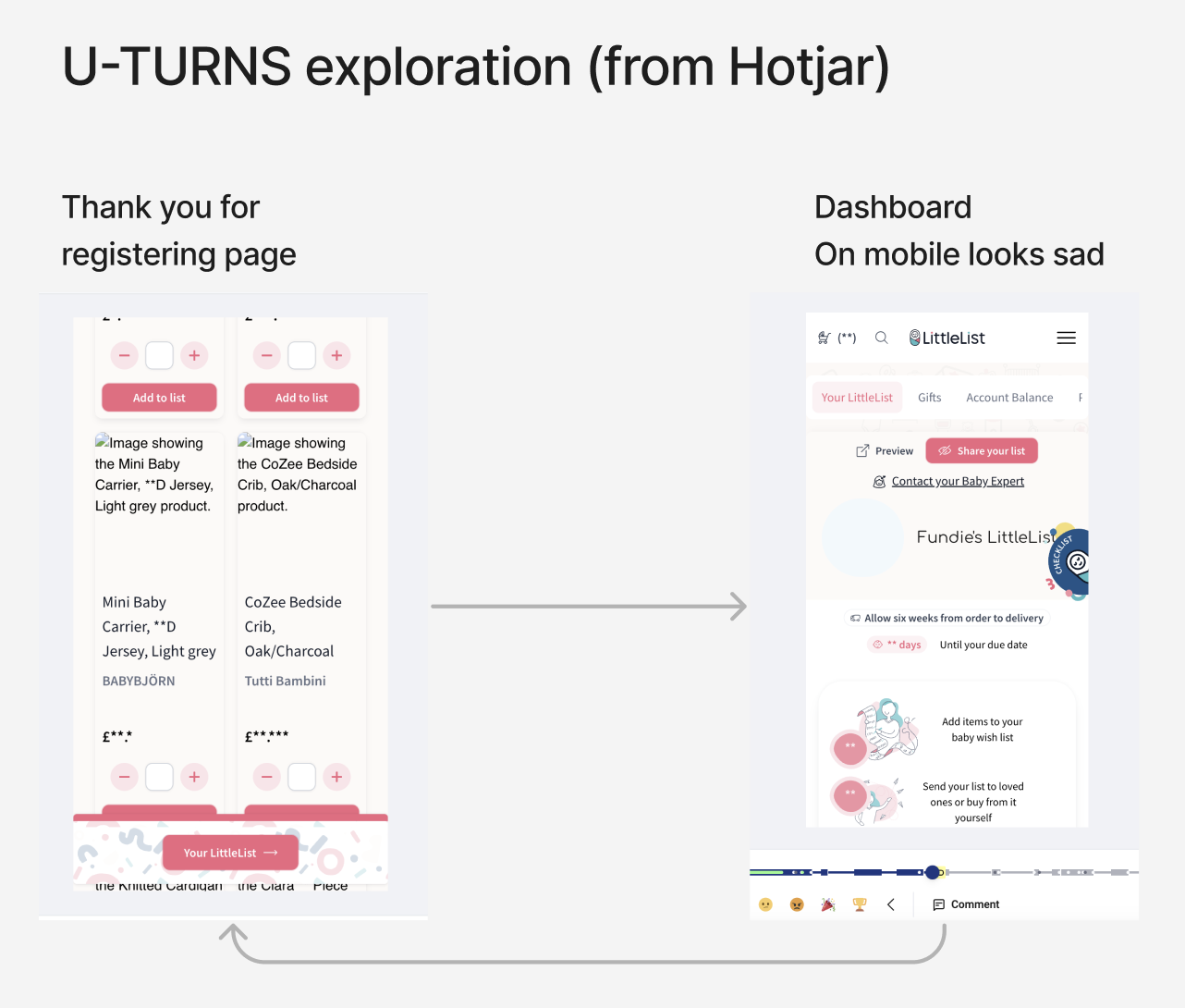
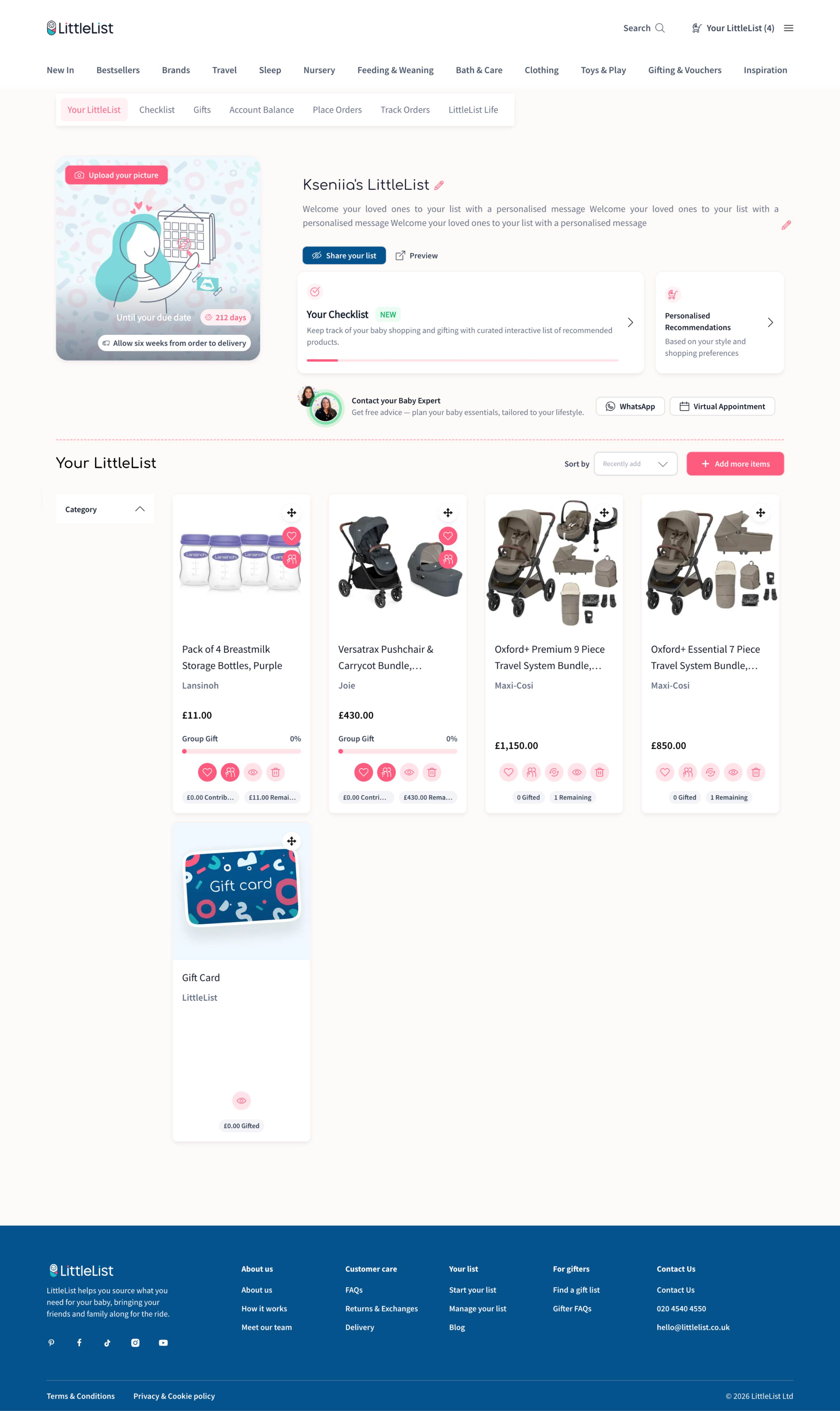
Dashboard & checklist
After registration, users landed on a dashboard meant to be their organisational hub. It wasn't working — 51 seconds average before bouncing, frequent U-turns. A full rebuild wasn't possible due to developer availability, so we iterated: cleaned up the layout, improved mobile nav, and gave users clear starting points — personalised recommendations, Baby Experts booking, and a checklist progress bar.
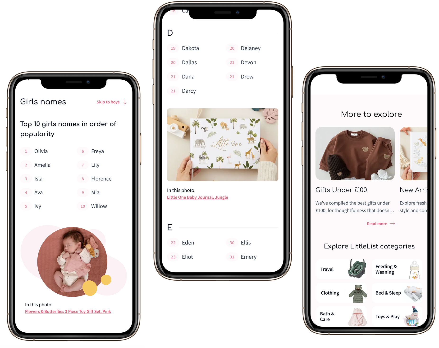
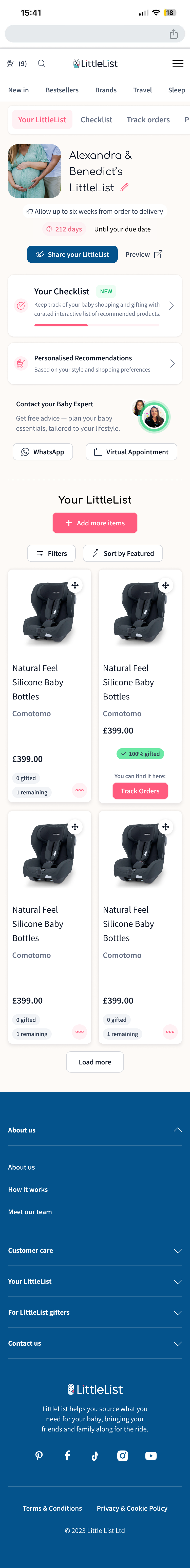
The checklist was one of LittleList's most loved features, trapped in the wrong format. It lived as a floating popup that looked like a chatbot icon — users kept dismissing it, and it was unusable on mobile. Data showed 10K clicks/month from 1.7K users but only 6% converted to Add to List — Hotjar confirmed most clicks were accidental. Yet the feature was highly requested in interviews, so the value was there.
We gave it a proper home. Logged-out users see an animated landing page designed to make the checklist an incentive to register. Logged-in users get it as a dedicated dashboard tab, connected to their list with a sticky "Back to Checklist" button to keep them browsing.
Checklist placement before the rework — a floating popup dismissed by most users
Checklist connection to the dashboard and browsing flow
Users landed here — often without adding anything yet — and had no idea where to start. The Baby Expert link was visible but didn't help someone still figuring out the basics. Non-interactive steps took up valuable space at the top, and the layout was overcomplicated with shadows and patterns competing for attention.
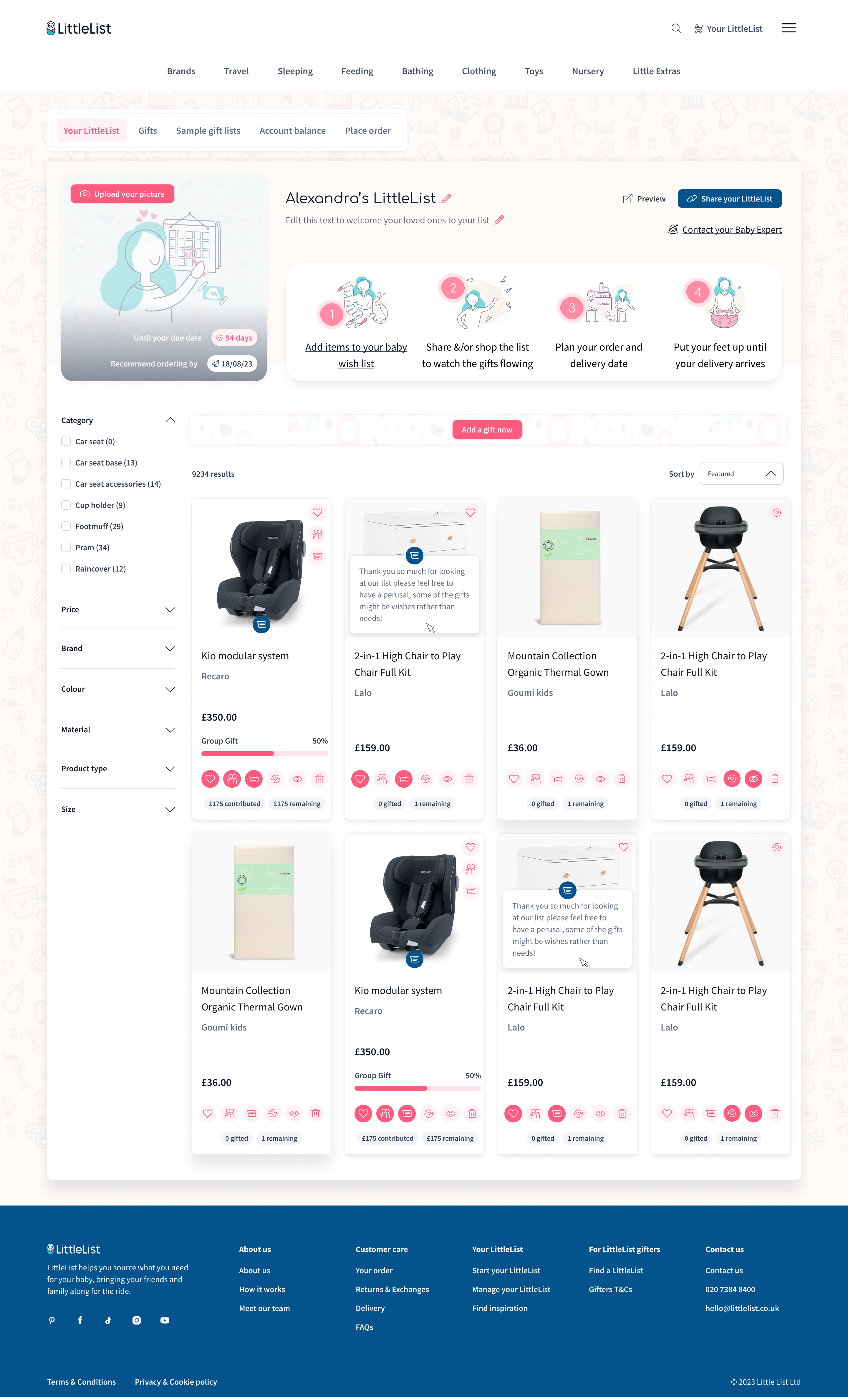
A full redesign wasn't an option due to developer availability, so we took an iterative approach. We cleaned up the layout and added visibility to organisational USP features — Baby Experts appointments and WhatsApp access, and the Checklist which now lives as a dedicated tab in the navigation. Personalised recommendations from onboarding are always accessible. "Your LittleList" title is now grouped with the actual list rather than sitting as a page heading, giving a clear separation between the dashboard tools and the list itself. We also renamed "Add gift" to "Add more items" — "gift" confused users who were shopping for themselves.

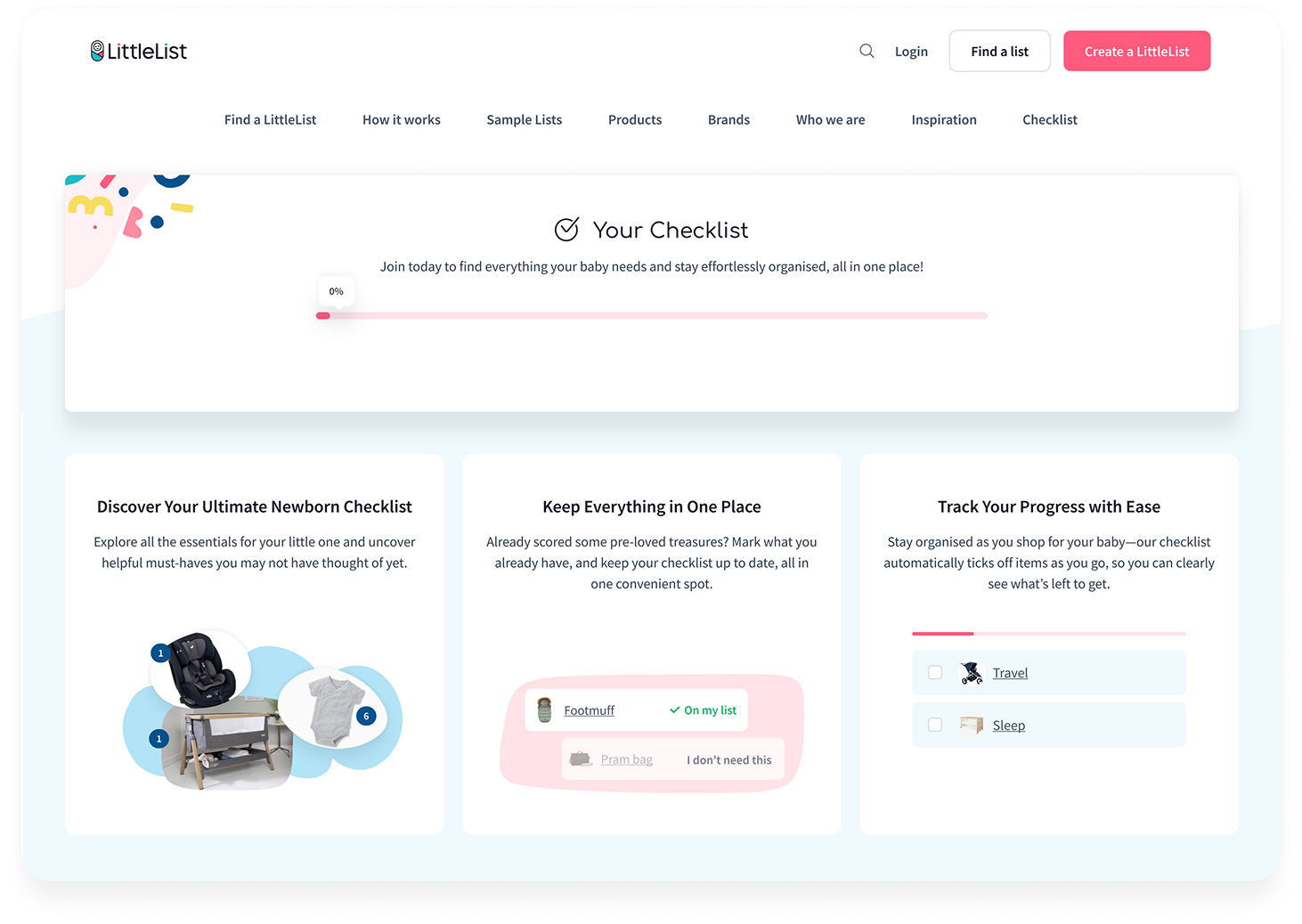
Checklist for logged-out users — accessible from the homepage, explaining how it works and why they need it before signing up
1 Research & Discovery → 2 Development by stage → 3 Results and next steps
Dashboard, Checklist & Add More Products
outcome
The Checklist launched on November 21, the Dashboard was cleaned up in early January, and the Add More Products page went live January 29. Even with staggered releases, the combined impact was clear within weeks.
Dashboard page views grew from 3.4K to 5.8K (+71%) between October and January, with sessions rising from 2,934 to 3,465. The new dashboard content blocks — introduced in the cleanup — quickly became the second most interacted-with element on the page, reaching 2K events by January. Sharing activity picked up too: share_your_list grew 25% and group gifting more than doubled (+108%).
Most notably, checklist interactions went from not even appearing in the site's top 10 events to ranking in the top 5 — a direct result of moving it from a dismissable popup to a dedicated page with proper visibility. The overall engagement trend shows a clear upward trajectory starting in January, with total daily events climbing from ~10-13K to consistently above 15K.
Overall Results
When I joined, the project's problems were tangled — the team knew something wasn't working, but not exactly what or why. Through the audit and research phase, I untangled those problems, made them visible to stakeholders, and got the whole team aligned on what to fix and in what order. I then prepared a UX improvement plan for the year, and we followed it. It worked.
What I'd suggest next
The foundations are now in place for deeper work: separating the product view from the Dashboard to reduce complexity, aligning the experience around Baby Shower Date (not just Due Date) to match how users actually plan, and optimising the revenue and fulfilment stage — taking users from "added to list" through to actual purchase. When resources allow, the platform is also ready for a full visual refresh.